Pachli 2.15.0 is now available. This release improves user safety by highlighting roles on accounts, updates the UI for Android’s edge-to-edge support, and has multiple improvements for video playback and emoji display and management.
New features and other improvements #
Combat phishing by highlighting roles on accounts #
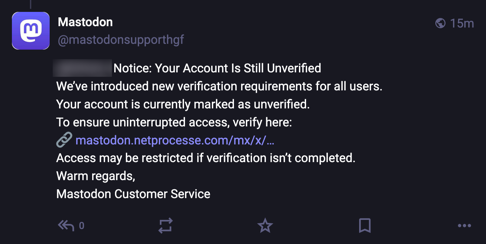
Many federated servers have recently seen an increase in phishing messages, designed to convince you to give your account credentials to unauthorised sites.
Here’s a screenshot of one example, shown in the Mastodon web interface.
To combat this, and to make it easier to identify legitimate messages from your server administrators and others, Pachli now shows any Roles an account may have next to the account’s details in timelines and account lists (e.g., when searching for accounts, or viewing accounts you have added to lists).
A role is a label your server administrators can add to your account.
This information was already shown (since Pachli 2.1.0) on the account’s profile screen but you had to look for it on every message.
In Pachli 2.15.0 roles are also shown as badges above the account’s name and other details, apart from any content the account can provide, making them impossible to spoof.
If you have Talkback or other assistive technology enabled the roles are also spoken as part of the account information.
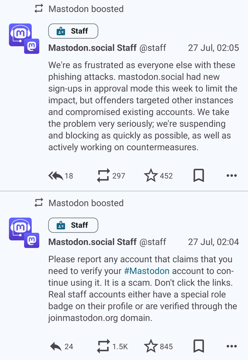
Here’s how this looks in Pachli 2.15.0 with two posts from @staff@mastodon.social, who have the “Staff” role on the mastodon.social server.
You will only ever see roles assigned by your server administrators to accounts on your server. For example, if your account is with hachyderm.io you won’t see roles on posts from @staff@mastodon.social as the account does not have any roles on your server.
Account profiles can also have one or more verified links. These refer to websites the account can prove it has a relationship with. Verified links are not a useful anti-phishing measure, as there is no way to prove the verified link is related to the server, and it is easy to create links where the site’s URL looks legitimate but is not (a homograph attack).
This is an additional layer of defense against phishing, but you should still be extremely cautious of any message asking for your account credentials, payment information, or anything else sensitive. The account may be legitimate but it may also have been hacked.
If in doubt you should always report the message to your server administrators (in Pachli, tap the “…” menu at the bottom right of any post and tap “Report”) and wait to hear from them.
Edge-to-edge UI #
Starting with Android 15 (February 2024) Google introduced a new design language for applications, edge-to-edge design. Content can now appear underneath the top system bar (where the time, battery information, and notifications are shown) and the bottom navigation bar (the buttons to go home, back, open recent apps, etc) if gesture navigation is disabled.
From August 2025 Google are requiring apps explicitly support this or be blocked from further updates in Google Play, so now Pachli supports edge-to-edge design.
For most screens in Pachli the UI changes are minimal. If there is fixed content at the top and bottom of the screen you shouldn’t see any difference. For example, when writing a post.
If there are no fixed items at the bottom of the screen you will now see content disappear off the bottom edge of the screen.
Here’s what this looks like in a Pixel 9 running Android 16 on the left and a Pixel 4a running Android 12 on the right (both emulated). The image in the second post runs off the screen in the Pixel 9 and is visible under the translucent navigation bar in the Pixel 4a.
![]()
![]()
The camera obscuring part of the system bar in the image on the right is a bug in the Android emulator, this doesn’t happen on real devices.
Viewing media (e.g., image and video attachments) now enables immersive mode. The Android top and bottom bars are hidden entirely (they can be re-shown by swiping from the top or bottom of the screen), allowing the entire screen to be used to display the image.
This doesn’t look very different when you first open an image:
![]()
But it’s quite different when you zoom in. On the left is Pachli 2.14.0, on the right is Pachli 2.15.0.
![]()
![]()
To improve the effect images are now loaded at larger sizes to ensure they are crisp when zoomed in.
Video playback #
A number of improvements have been made to video playback.
Mute and unmute #
Eric Lathrop suggested (#145) it should be possible to mute videos, and set whether the default should be muted or unmuted. Great idea, and now you can. Use “Preferences > Default audio playback” to change the default from “unmuted” to “muted” for all media.
Alternatively, when you are playing media there is a new “mute” button towards the bottom right of the user interface.
Pause when swiping between videos and images #
Mastodon doesn’t let you add more than one video to a post, or attach a mix of images and videos to a post.
But other software does, and if you follow people who do then you might see posts in your timeline with more than one video attachment, or with a mix of media.
Previously, if you were playing an attached video and swiped to the next or previous attachment the video would continue to play in the background. Now it is automatically paused when you swipe.
Pause when headphones are removed #
You might be listening to an audio attachment or playing a video attachment with headphones connected.
Now, if you disconnect the headphones the media is automatically paused, so anyone around you cannot hear whatever you were listening to.
Toggles for the repeat mode #
You can now choose whether media should play once and then stop, repeat once and then stop, or repeat forever, using the player control at the bottom of the screen.
Display subtitles #
Some servers may allow people to upload video with subtitles. If they do there is now a player control at the bottom of the screen to enable or disable the subtitles.
At the time of writing I know that both Mastodon and GoToSocial servers will strip the subtitles from any videos you upload.
Player control UX #
Sometimes the video playback controls could appear to “stutter” on to the screen, appearing briefly, disappearing, and then reappearing. This is fixed.
The playback controls (play/pause, skip forward/back) were very close to the track position indicator, making it easy to inadvertently skip to a different place in the media when you wanted to hit the pause button. Those controls have been moved further up the screen to make this less likely.
Emojis #
The experience of writing and viewing emojis has been improved.
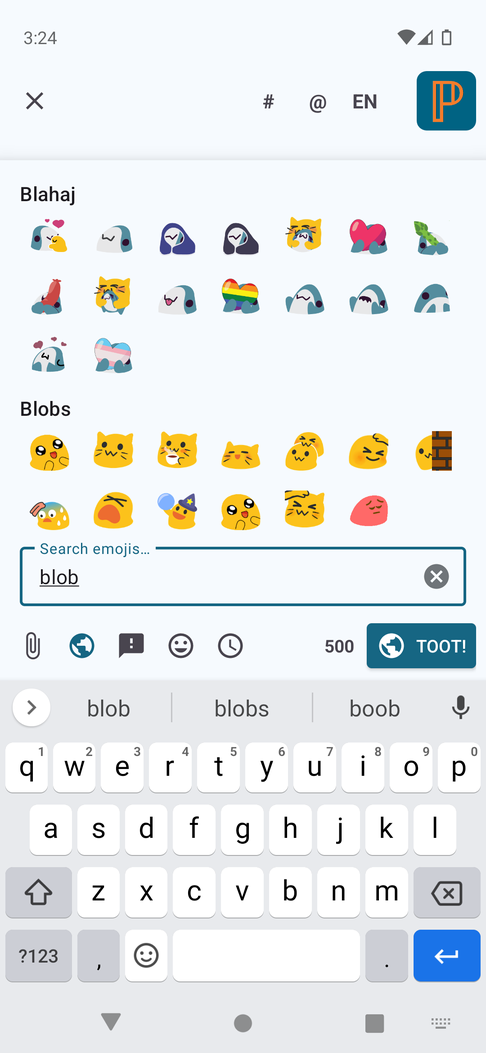
Show emojis grouped by category, and searchable #
Previously, when selecting emojis in the post editor Pachli showed you a short list of the emojis, and you had to scroll horizontally to see them all. Although emojis might be in different categories it wasn’t obvious, and on servers with hundreds of emojis (e.g., see the emojis on hachyderm.io) finding the one you wanted was difficult.
Marcel filed #1226 suggesting it would help if they were scrolled vertically and there was more space.
This has been done. In addition, emojis are now grouped by their category, and there is a search field. As you type in the field emojis are filtered to those where the text you entered matches either the category or the emoji name.
Correctly display emoji with landscape dimensions #
Some emojis can be a lot wider than they are tall. Pachli was displaying them by scaling the emoji to roughly square dimensions, so wider emoji could appear tiny in some cases. This is now fixed (#1626).
Show an account’s emojis when replying #
When you create a reply Pachli shows you the “display name” of the account you are replying to. This can contain emojis, but they weren’t drawn when you were writing your reply. Now they are (#1629).
Show emojis in descriptions of “obscured” links #
Mastodon doesn’t let you provide “link text” for a link, the way a web page does. Here I can write “Go to the Pachli website” and you see “Pachli website” as the link, not the URL. You can’t do that on Mastodon.
But you can with other software federating with Mastodon. For links like this, and to ensure you know where the link goes, Pachli shows the link text and then puts the link destination in parentheses after the link. This is an “obscured” link.
If the link text contained emojis they weren’t shown properly. Now they are (#1620).
Show moderation warning notifications #
If a moderator takes an action against your account you’re sent a notification. Pachli was displaying those as a generic “Unknown notification”.
Now they are displayed correctly.
Mastodon doesn’t provide an API to allow you to take action when you receive one of these notifications, e.g., to file an appeal. Instead, you must go to the website. So tapping the notification will open the (Mastodon specific) link, allowing you to see more information and appeal if necessary.
Updates to translations #
Languages with updated translations are:
- Estonian by Priit Jõerüüt
- Finnish by Kalle Kniivilä
- German by Thomas Cloer
- German by RealZero
- Irish by Aindriú Mac Giolla Eoin
- Italian by Dizro
- Latvian by Edgars Andersons
- Lithuanian by Vaclovas Intas
- Norwegian Nynorsk by sunniva
- Polish by Łukasz Horodecki
- Russian by Yurt Page
- Slovak by Russssty
- Spanish by Juan M Sevilla
- Tamil by தமிழ்நேரம்
If you would like to help improve Pachli’s translation in to your language there’s information on how you can contribute.
Significant bug fixes #
Prevent crash when replying from notifications #
Blaise Pabon reported an issue where using the “Quick reply” feature from a notification would crash, and the reply would not be sent. This is fixed with #1692.
Show the account’s username (includes domain) when replying #
Normally Pachli shows an account’s handle as either @username (if they use the same server you do), or @username@server if they use a different server.
This wasn’t the case when replying to a post, the handle was always shown as @username even if they were on a different server. This is fixed with #1688.
Reduce network calls when filtering notifications #
If you filter your notification by type (“Follow”, “Mention”, “Boost”, etc) then Pachli used to fetch all your notifications and then perform the filtering on your device.
This was quite inefficient if you filtered out a lot of notification types, and could lead to flickering in the UI. #1684 uses the server to do the filtering, which should be faster, make fewer requests to your server, and have no flickering.
Don’t crash when sharing media #
Sharing an attachment from Pachli to another application downloads the attachment to your device first. In some cases the download could happen in a way that triggered a crash in a system supposed to keep the user interface feeling snappy. Fixed with #1660.
Prevent empty lists when tapping on tabs #
One of the Android UI libraries has a bug where lists (e.g., one of your timelines) appear to be empty. Tapping anywhere on the list would immediately show the content (this is Google bug 432664597).
The work-around for this bug pre-loads content from more of your tabs, so this should have the side effect of making the Pachli UI feel a bit faster (#1656).
Don’t crash when managing accounts on older API devices #
The UI for managing accounts introduced in the previous release could trigger a crash on older Android devices because of a bug with how they handle colour. Fixed with #1646.
Use correct icon color/spacing for the add media buttons when writing a post #
While working on the “write a post” UI for the edge-to-edge and emoji picker enhancements I noticed the icon colours and spacing for the options to add media were wrong. They’ve been fixed in #1645.
Don’t crash when showing dialog to choose a push provider #
If you have more than one Unified Push application installed Pachli will show you a dialog to choose the one you want to use. In some cases this could trigger a crash, fixed with #1630.
Thank you #
Thank you to everyone who took the time to report issues and provide additional followup information and screenshots.
Download Pachli 2.15.0 from Google Play, F-Droid, or the GitHub release page.